
Logos and branding are certainly not the most important aspects of a project but they do create a sense of community and common goals and ultimately capture what a collaborative project is meant to achieve. Thus, let us explain our branding.
First of all, the name of the consortium: HILIGHT. Not a proper acronym as we have to borrow letters from the title of our grant proposal but a name that works. Its origin can be tracked from this title contraction:
Highly Integrated Versatile Laser Source enabling two-photon excitation in digital diagnostics and biomedical research.
You can also think about us developing semiconductor technologies for ultra-fast diagnostics, trying to highlight where cancer is in a tissue. Then you are a spelling error away from our name.

The font (impact) and the heavy inclination express our commitment for fast development of innovative semiconductor technologies to disrupt healthcare applications. The colour choice is to recall the near-infrared spectrum we are using to image samples.

We also wanted to integrate some graphical elements explaining our approach. The first step was to work in the dot of the first “i”. The dashed lines refer to our capabilities to shape bursts of high power high frequencies laser pulses to shape optimal excitation conditions for tissue imaging. The “decaying spectrum” illustrates our target to generate tissue contrast using fluorescence and quantifying fluorescence lifetimes.
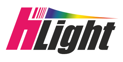
When iterating the design, we decided to squeeze the HI of HILIGHT into a single element, after all… a highly integrated laser might require a highly integrated logo, doesn’t it?
All other versions of logos you will find in our website and documentation are based on those basic concepts.
